What do I put on my bedroom walls?
I should have spent at least part of today putting the birdy pics in the Walgreens frames. Didn't. Instead, pulled out tons of old stuff from the closets (seemed to have multiplied over the years, what?) and spread it out in the light of the bedroom. But it was really sunny today and even with both windows fully covered and the curtains not pulled back, I couldn't get semi-decent photos of the main contenders until close to 5 p.m.
Which means, darlings, that SPRING IS ALMOST HERE! That also means we may still experience one or more blizzards...
OHMYGODDESS, you have no idea how happy that makes me.
Back to bedroom decor -- here are the major pieces I have. Major meaning size-wise. Sorry for the photos, not the best. Instead of dealing with too little light, I was dealing with too much light! And trying to get the full pics into these pics, so I plopped everything on top of the bureau and photographed them that way:
Suspect No. 1: A Home Interiors entry. Love the frame. Not so hot on the rather greenish and definitely MAUVE faux borders. Because despite the price I paid for the lovely, it doesn't have its own separate mat! But the subject is beautiful. I believe they are dogwood blossoms.
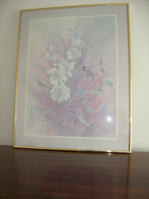
Suspect No. 2: Mom gave this to me I don't know how many years ago, exactly. More than 25, to be sure! I love the print, but the frame has seen better days and doesn't evoke the kind of vibe I'm into these days. This is all of one piece and I'd have to strip it down, probably trashing the frame, in order to get at the "print," and then somehow cut it down to size to fit into a different frame if I'm not able to get a mat and frame that would exactly fit it otherwise. Talk about CHA-CHING!!!!! Not to mention those pastel colors, faded over the years, would be very hard to match. But oh, the ethereal look of this -- still love it after all these years. And it sure would look fab in my room, wouldn't it? If there was just the perfect spot for it...
Suspect No. 3: This is actually a poster I picked up hmmm, don't remember when. It's put over an earlier Home Interiors pic of two cardinals. Beautiful in its hey-day, now grossly faded. I took the mat and painted it - those 90's colors again! It's big and beautiful, and would definitely make a statement. But the mat needs to be repainted, or disappeared entirely???
Suspect No. 4: Not the best photo. This is another Home Interiors entry called "Roses, Roses!" and it really is lovely, although faded. Considering what I paid for these Home Interiors wall art, it is disappointing, to say the least. I have at least three Home Interiors prints stashed away in my upstairs closets! Geez, I never realized how big those seemingly smallish looking closets are until I started digging around in them... Rather like Alice Through The Looking Glass. I love the frame on t his pic and when it was not faded, it was gorgeous. It's still very pretty, and very very girly. As you can see, it definitely as a "green" element going. Don't think it's what I'm looking for. I was thinking that part of Suspect No. 2 would look gorgeous framed out in this. But then, Suspect No. 2 would also look gorgeous framed out in Suspect No. 3...
Suspect No. 5: Birds, ordered from K-Mart online some years ago. It actually came form some merchant-sharing program they had at the time, I think. I love it! I love the frame, the mat, and the compositiojn of the print. It actually looks like it has a third (or is that fourth?) mat around it, but that damask-look around the bird pic is actually not a mat at all, but part of the pic. This was originally ordered for the guest room, and hung in there for at least a few years until I abducted it in late 2009 after my bedroom had been repainted.
Soooo, what do I do? What do I do?


No comments:
Post a Comment